Drag and Drop Element
This guide provides a detailed explanation of the Drag and Drop Element in Construct, including its settings, properties, and metadata.
Overview
The Drag and Drop Element allows users to create interactive activities where draggable items are matched to specific target areas. This document explains the available settings and functionalities to customize the element for your needs.
Requirements
- Access to the Construct platform.
- Administrator or content editing permissions.
- Appropriate assets uploaded to the Asset Library.
Element Settings
General
Locked
The Locked checkbox, labeled Lock this and children, secures the content item and its associated elements.
Children refers to elements nested within other elements, such as:
- Elements nested under Key Learning Points (KLPs),
- KLPs under Teaching Points (TPs),
- TPs under Learning Objects.
 Figure 1: Locking Function
Label
The Label field creates a unique identifier for the content item, used for debugging and auditing purposes. The label can differ from the Title.
- Clicking the return icon resets the label to the default text: "New Component Title".
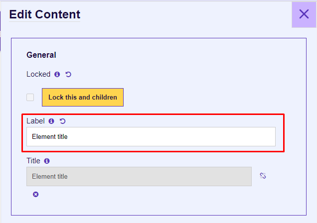 Figure 2: Element Label
Title
The Title input defines the title of the content item, displayed in the presentation view and Word outputs.
- The title is linked to the label by default and can be unlinked using the chain icon.
- The x icon removes the title if unnecessary for outputs.
 Figure 3: Title Input
Properties
Question Text Area
The Question Text Area displays the question above the main graphic and drag options.
- For details about CKEditor controls, refer to the CKEditor Controls.
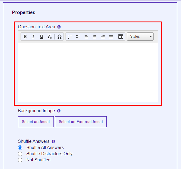 Figure 4: Question Text Area
Background Image
The Background Image serves as the primary graphic for drag targets.
- Select an Asset allows users to upload or choose an animation ZIP folder from the Asset Library.
- Select an External Asset is currently non-functional.
 Figure 5: Background Image
Shuffle Answers
This feature is available for migration purposes only and is not actively used.
 Figure 6: Shuffle Answers
Number of Retries
This functionality is reserved for migration purposes.
Figure 7: Number of Retries
Target Areas
Target areas are defined zones on the main graphic for drag-and-drop interactions. Positioning uses pixel values (integers), not percentages.
For migrated content, repositioning is necessary to align the target areas.
- Percentage Left: Position from the left edge.
- Percentage Top: Position from the top edge.
 Figure 9: Target Areas
Drag Items
Drag items are displayed beside the main graphic. These are interactive elements that users drag onto targets.
- Image Field: Select an image asset for use as an answer.
- Positional properties (e.g., width, height) are inactive.
Figure 11: Drag Items
Matching of Targets to Items
Match drag items to target areas using indices:
- Target Area Index: Assigns a target to a drag item.
- Drag Item Index: Assigns a drag item to a target.
The first index always starts at 0.
Figure 13: Matching of Targets
Output Types
ILT (Instructor-Led Training)
- Instructor: Displays in the instructor presentation window (text and list components only).
- Student: Displays in the student presentation window.
Word
- Student Notes: Includes the element in the Student Manual output.
- Instructor Guide: Adds the element to the Instructor Guide and the instructor presentation window.
 Figure 15: Output Types
Metadata
Job Roles
Use the Job Roles dropdown to assign roles.
- Accessible via: Hamburger menu > Administration > Metadata.
 Figure 9: Job Roles Metadata
Other Metadata
The Other Metadata button allows for custom metadata, primarily used during migration.
 Figure 12: Other Metadata
Save Changes
Important: Always click Update to save changes. Unsaved changes will be lost upon exit.
To discard changes, click Cancel or the purple X button.
 Figure 13: Update and Cancel Buttons